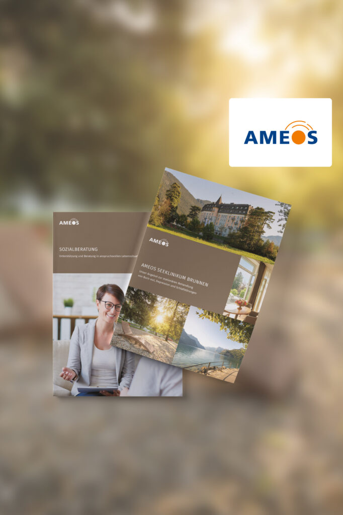
Coporate Design is the visual embodiment of a brand, triggering emotional responses and creating a distinct sense of recognizability. It runs through all levels of a company and builds trust with both customers and employees. A brand is more than just a name.
Task
Following the implementation of the new sub-brand AMEOS Health Facilities Switzerland, under the AMEOS Group, a consistent, stringent and upscale design language needed to be developed – one that reaches and engages the target audience and effectively communicates brand values.
Realization
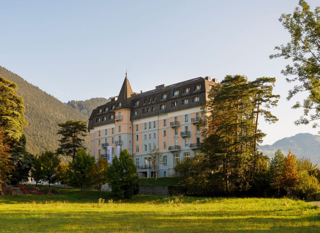
Throughout the course of multiple iterations, priorities and measures of the rebranding process were developed together with the client’s team. During this phase of the project, the collaborative effort at eye level as well as the shared understanding of the underlying goal were absolutely essential.
Design & Result
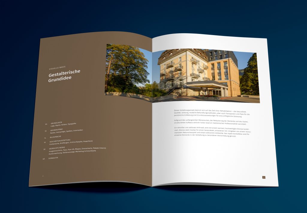
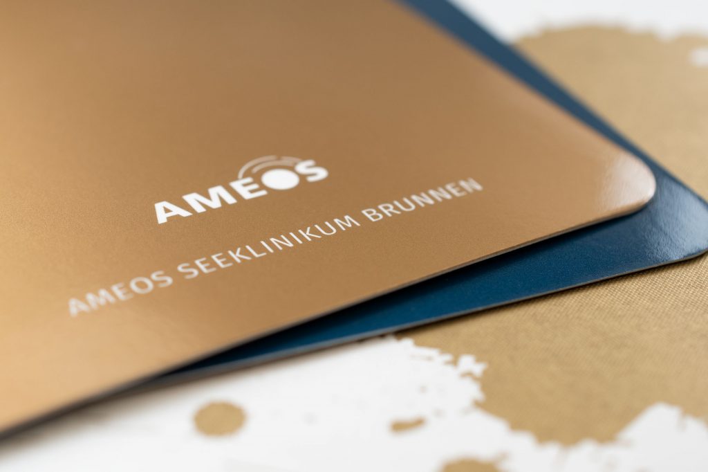
Clear structures, an upscale color scheme and an exclusive visual language reflect the brand’s message: when it comes to your health, we’re your partner. Great attention was paid to the selection of materials, aiming for a high-quality and tactile feel: in this case, we settled on a type of paper with a special finish (Pantone Metallic Bronze).
A holistic solution
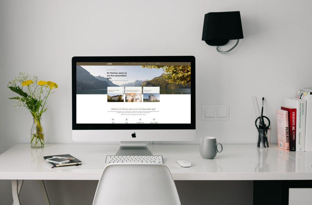
The entire brand presence was closely coordinated across digital and printed media and developed in close collaboration with all involved parties. The result is a solid, elegant, and above all cohesive product.
More information:
» ameos.ch | Website for the AMEOS Health Facilities Switzerland
