New horizons, new target group: the CD enables a targeted approach, conveys trust and the highest level of expertise.
The new CD for the MEDIAN GROUP was necessary because the Median group of companies was expanding in an international context. High recognizability and user-friendliness were a goal.
THE TASK
The MEDIAN GROUP, with more than 425 facilities, has also been present abroad since 2021 and took over facilities in the UK and Spain. The MEDIAN GROUP’s corporate design needed to differ from MEDIAN’s appearance in Germany, but still be recognizably MEDIAN. The design should take the new target group into account: instead of patients, it is investors and users from politics and the (healthcare) industry.
THE IMPLEMENTATION
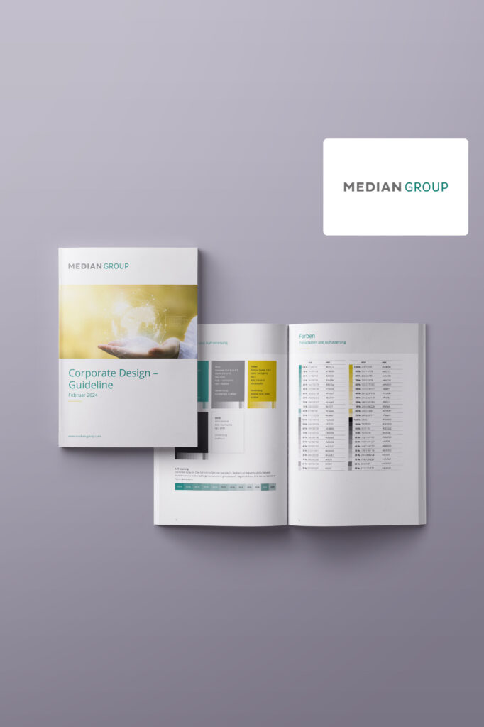
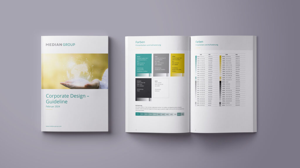
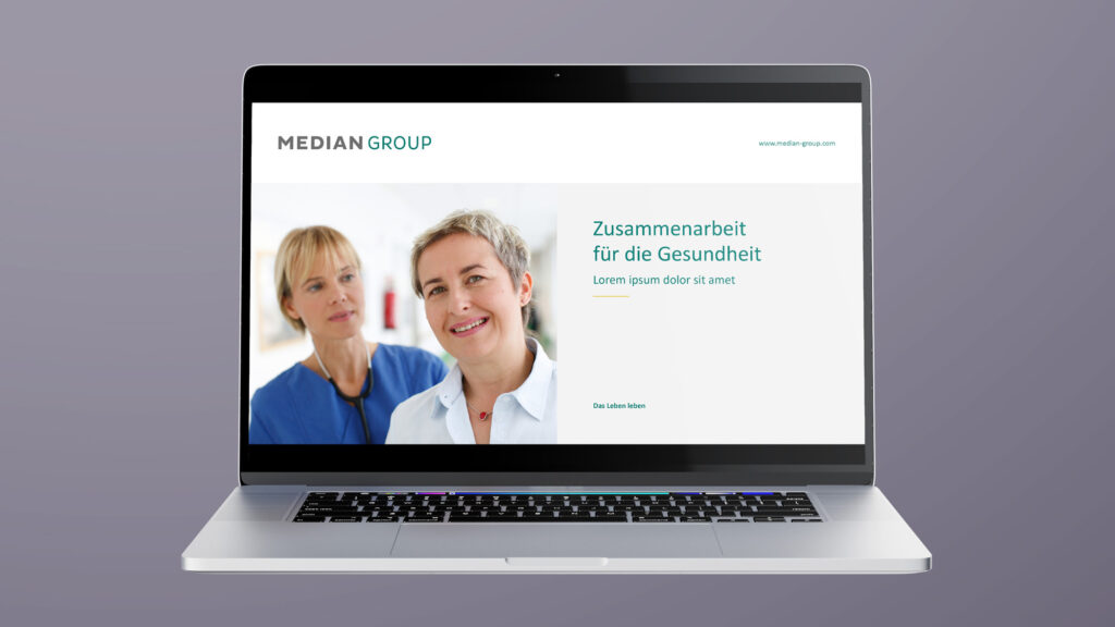
The basic design idea was: The MEDIAN GROUP is the reliable partner when it comes to health. Years of experience and a constantly growing network of healthcare partners guarantee competence. The slogan “Living life” was adopted unchanged to facilitate recognition. The color scheme was revised. The customer’s wish was to extend the existing color spectrum by one color, taking accessibility into account. Overall, the design and content were to appear simpler, more factual, “technical” and cooler, but convincingly competent and without any loss of information.
THE RESULT
The reduced design and restrained radiance of the colors suit the company’s new target group, but the proximity to MEDIAN in Germany remains clearly recognizable. Extensive white space, the reduction of elements and a clearly structured layout convey a high degree of medical professionalism. The use of the golden ratio and color-coordinated images creates a harmonious and trustworthy feeling. Both attributes stand for a long-lasting and fruitful partnership. Relevant information is always underlined with the friendly yellow, among other things to emphasize the focusing and goal-oriented character of a professional medical partner.
Both corporate designs are based on the same principles and use the same basic rules. All templates are designed to be easy and straightforward to use for future users: solid, practical and functional.